Rise of Ukraine: new identity — new dawn
The world is changing — and we are changing with it.
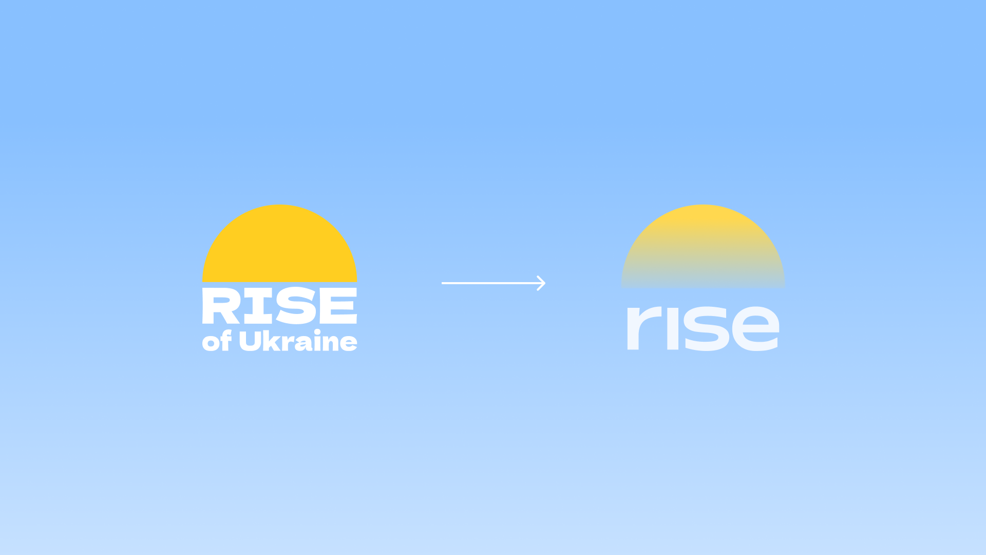
This year, Rise of Ukraine is undergoing not just a design update, but a complete rebranding — a symbol of a new stage of growth, expansion, and maturity.
Why we decided to update
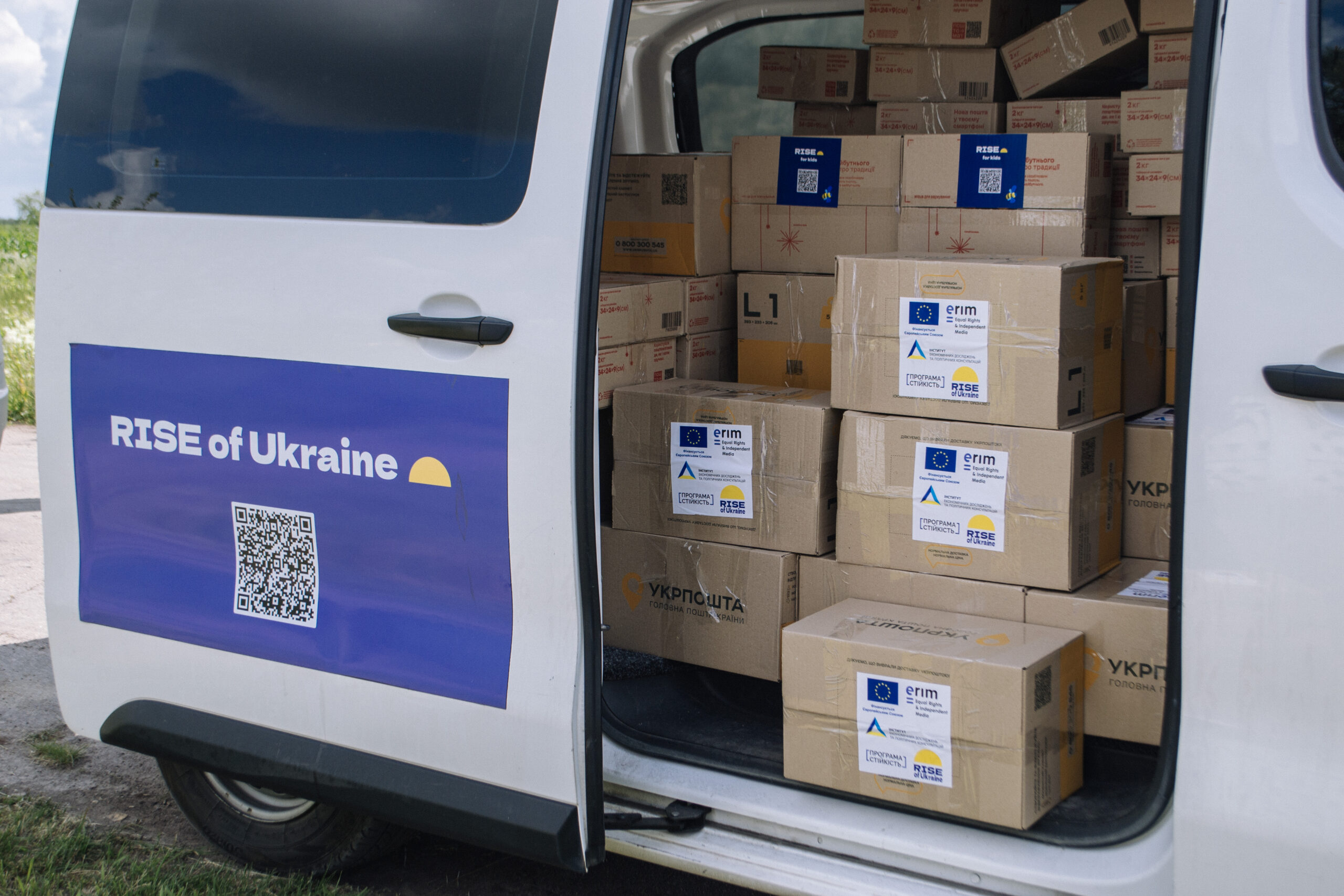
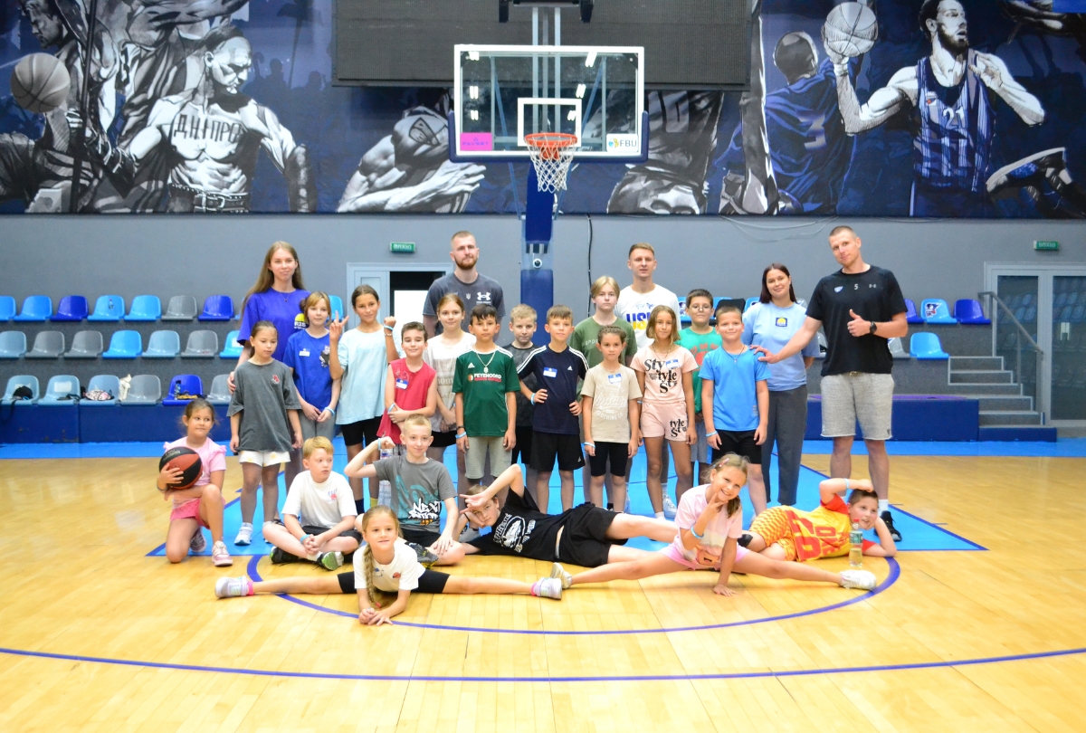
From our first humanitarian initiatives in Dnipro to large-scale educational projects throughout Ukraine, we have come a long way that has changed us.
We have grown bigger, more experienced, and, most importantly, closer to the people we work for.
So, the time has come when we wanted our identity to reflect this new energy.
“For us, the new identity is not just a visual update, but a symbol of a new beginning and a stage of growth. We have opened a new space in Kyiv, are launching new projects, and are scaling our activities to more regions. We remain ourselves, but with new strength. Identity is not a change in essence, but an evolution: more projects, more depth, more bold decisions for change” says Yana Paladieva, CEO of the foundation.
New identity: a symbol that speaks
At the heart of our identity remains what has always been the heart of Rise — the sun.
Its rays represent a new beginning, warmth, support, and faith that we bring to communities.
Just as dawn dispels the night, our work helps people see the light at the end of even the darkest days.
The new visual system retains the familiar symbol but expands its meaning: dynamic graphic elements now surround the logo, symbolizing movement, growth, and interaction.
The colors have become cleaner and brighter, with shades of yellow, pink, and blue representing calm, care, and trust.
How the identity was created
The rebranding process took several months. We explored how to visually convey Rise’s main mission — to “lift up” those in need of support and bring light where it is lacking.
Together with the team at the creative agency Aidlers, we tested several directions: from concepts of movement and collective action to the metaphor of sunrise.
As a result, dawn became the perfect image: it combined tenderness and strength, stability and a new beginning.
What’s next
Rebranding is not a full stop, but a comma.
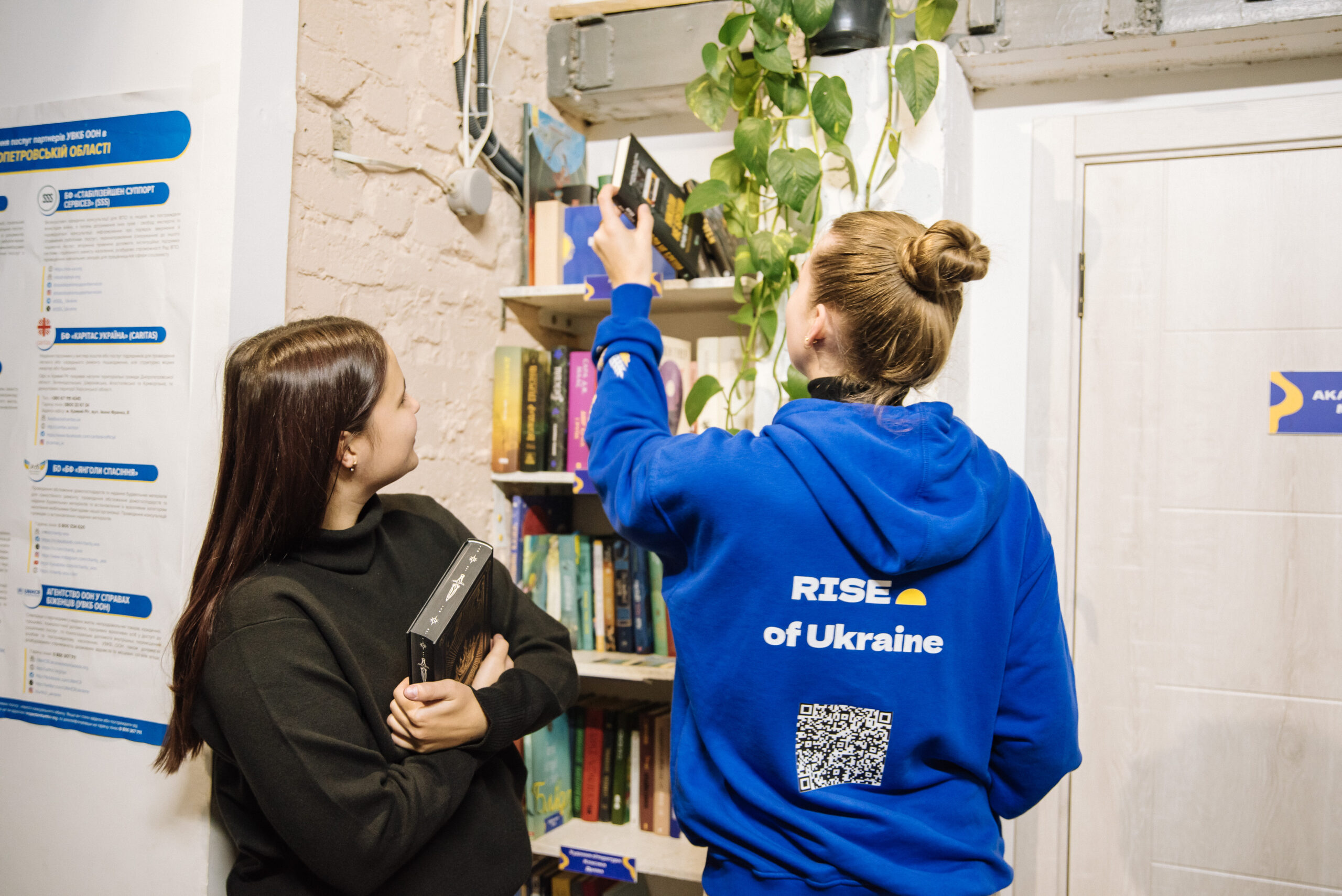
We are already working on new visual materials, updating the website, and preparing merchandise with the new logo.
Soon, our partners, friends, and everyone who supports us will be able to get it — because goodness and aesthetics need to be spread.
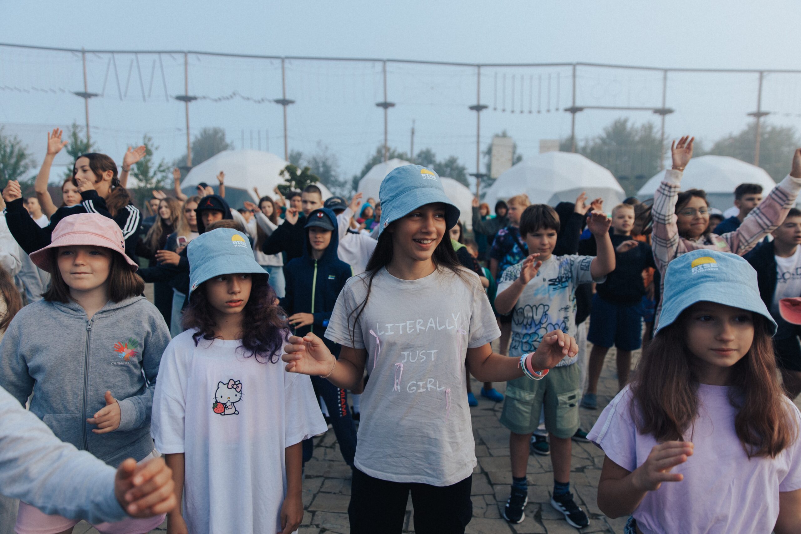
We are moving forward: opening new spaces, launching large-scale projects, and helping communities and children throughout Ukraine.
And our new identity is our dawn, from which a day of change begins.